页面中如果有两种或多种指定颜色之间的平滑过渡的渐变效果,会使得我们的视觉效果瞬间提升几个档次,在CSS3中有提供的多个渐变方式属性就能让我们轻松实现这样的渐变效果。
目前CSS渐变属性有六个,分别为:linear-gradient(线性渐变),repeating-linear-gradient(重复线性渐变),radial-gradient(径向渐变),repeating-radial-gradient(重复径向渐变),conic-gradient(锥形渐变),repeating-conic-gradient(重复锥形渐变); CSS渐变属性作用是从一种颜色平滑渐变到另一种颜色的图像,那么background-image和border-image属性都可以用渐变作为图片内容。 下面,我们就分别来看看这几个属性的效果
linear-gradient和repeating-linear-gradient
线性渐变以直线的方式,可向左、向右、向上、向下、对角方向延伸,使用频率很高。要创建线性渐变,需要指定两种及以上的颜值和方向,如果未指定方向,默认为上到下渐变。
使用语法:
1
| background-image: linear-gradient(direction, ColorStop1, ColorStop2, ...,ColorStopN);
|
- direction的取值有:
to right(向右)、to bottom(向下)、to bottom right(向右下角)、180deg(向下)
- ColorStop为指定渐变颜色和渐变位置,颜色代码可以是十六进制颜色代码,RGB颜色代码。位置可以是百分比也可以是像素
1
2
3
4
5
6
7
8
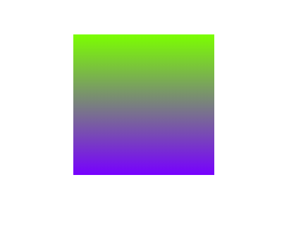
| <div class="bg">
</div>
.bg{
width: 200px;
height: 200px;
background-image: linear-gradient( rgb(123, 255, 0),rgb(119, 0, 255));
}
|
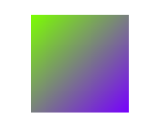
1
2
3
4
5
| .bg{
width: 200px;
height: 200px;
background-image: linear-gradient(to bottom right, rgb(123, 255, 0),rgb(119, 0, 255));
}
|
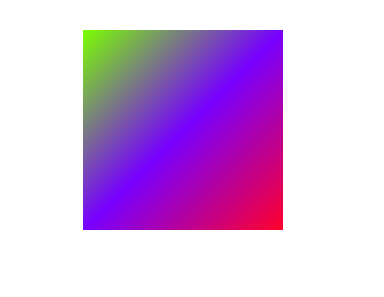
1
2
3
4
5
| .bg{
width: 200px;
height: 200px;
background-image: linear-gradient(to bottom right, rgb(123, 255, 0),rgb(119, 0, 255),rgb(255, 0, 43));
}
|
1
2
3
4
5
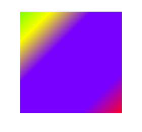
| .bg{
width: 200px;
height: 200px;
background-image: linear-gradient(to bottom right, rgb(123, 255, 0) 0,rgb(251, 255, 0) 15%,rgb(119, 0, 255) 35% 80%,rgb(255, 0, 43));
}
|
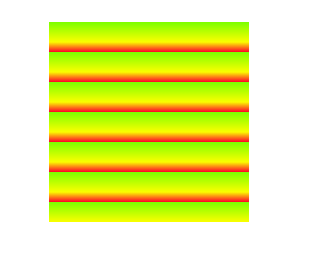
repeating-linear-gradient用得可能比较少,它是基于linear-gradient进行重复平铺操作
1
2
3
4
5
| .bg{
width: 200px;
height: 200px;
background-image: repeating-linear-gradient(to bottom, rgb(123, 255, 0) 0 ,rgb(251, 255, 0)10%,rgb(255, 0, 43)15%);
}
|
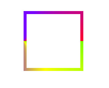
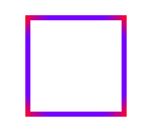
前面都是渐变背景,我们再来看看渐变边框是什么效果
1
2
3
4
5
6
7
| .bg{
width: 200px;
height: 200px;
border-width:10px;
border-style:solid;
border-image:linear-gradient(to bottom right, rgb(123, 255, 0) 0,rgb(251, 255, 0) 15%,rgb(119, 0, 255) 35% 80%,rgb(255, 0, 43)) 1 10;
}
|

radial-gradient
径向渐变以由中心点由圆或者椭圆向外扩散,使用语法
1
| background-image: radial-gradient(shape size at position, ColorStop, ..., ColorStopN);
|
shape 圆类型,就两种:ellipse(椭圆)和circle (圆),默认ellipse
size 渐变大小,分别有farthest-corner(从圆心到圆最远的角为半径),farthest-side(从圆心到圆最远的边为半径),closest-corner(从圆心到圆最近的角为半径),closest-side(从圆心到圆最近的边为半径),Size,默认是farthest-corner,
position 位置:left,right,top,bottom,center或者数值比分比,默认是center
ColorStop,渐变颜色和渐变位置
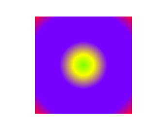
radial-gradient的用法和linear-gradient的用法相似
1
2
3
4
5
| .bg{
width: 200px;
height: 200px;
background-image: radial-gradient( rgb(123, 255, 0) 0,rgb(251, 255, 0) 15%,rgb(119, 0, 255) 35% 80%,rgb(255, 0, 43));
}
|
1
2
3
4
5
6
7
| .bg{
width: 200px;
height: 200px;
border-width:10px;
border-style:solid;
border-image:radial-gradient(rgb(123, 255, 0) 0,rgb(251, 255, 0) 15%,rgb(119, 0, 255) 35% 80%,rgb(255, 0, 43)) 1 10;
}
|
conic-gradient
一般情况下,用conic-gradient的场景比较少,但我们也可以基本了解一下。其基本语法:
1
| background-image: conic-gradient(from angle at position,ColorStop, ...,ColorStopN);
|
- from angle 起点角度,默认0deg
- position 位置:
left,right,top,bottom,center或者数值比分比,默认是center
- ColorStop,渐变颜色和渐变位置
1
2
3
4
5
| .bg{
width: 200px;
height: 200px;
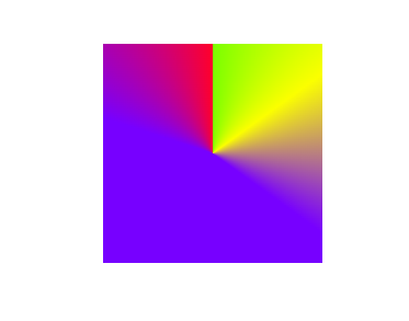
background-image: conic-gradient( rgb(123, 255, 0) 0,rgb(251, 255, 0) 15%,rgb(119, 0, 255) 35% 80%,rgb(255, 0, 43));
}
|
1
2
3
4
5
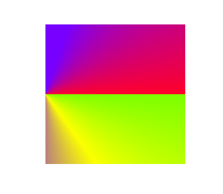
| .bg{
width: 200px;
height: 200px;
background-image: conic-gradient(from 90deg at left, rgb(123, 255, 0) 0,rgb(251, 255, 0) 15%,rgb(119, 0, 255) 35% 80%,rgb(255, 0, 43));
}
|
1
2
3
4
5
6
7
| .bg{
width: 200px;
height: 200px;
border-width:10px;
border-style:solid;
border-image:conic-gradient(from 90deg at left, rgb(123, 255, 0) 0,rgb(251, 255, 0) 15%,rgb(119, 0, 255) 35% 80%,rgb(255, 0, 43)) 1 10;
}
|